
Visit UConn’s homepage with your smartphone and you’ll see something new.
“Would you like to view the m.uconn.edu mobile site?” reads the tiny pop-up message.
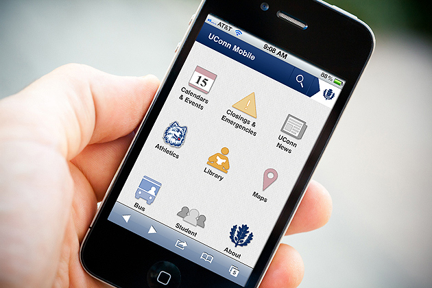
Those who choose ‘Yes’ are treated to an assortment of UConn-related links appropriate to an audience on the go.
Welcome to m.uconn.edu, the University’s official mobile homepage and the latest initiative in UConn’s comprehensive online efforts.
 Officially launched on Jan. 17, m.uconn.edu received more than 3,000 hits in its first week – 40 percent of which were return visitors. And with an average visit of nearly two minutes, the website seems to be serving its purpose.
According to Robert Chudzik, manager of internet services in the Office of University Communications, that purpose is to serve as an entry point for UConn mobile resources. “The mobile site is a functional utility intended for localized information,” says Chudzik. “It’s not everything, and that’s by design.”
Indeed, visitors to m.uconn.edu – sometimes referred to as “m-dot” – should not expect to simply find a small version of the regular UConn homepage. With links to quick-hitting resources like campus bus schedules, the Storrs campus map, the Homer Babbidge Library, UConn news, sports scores and schedules, and the all-important emergency closings page, the m-dot highlights all of UConn’s mobile content in one place.
And it comes at just the right time.
Mobile use is outpacing desktop use, and mobile visitors know what they want and how they want it.
“New students expect this,” says Chudzik, noting that the demographic of mobile users exactly matches that of college students.
One of the most difficult challenges Chudzik’s team faced was in deciding what belonged on m-dot and what did not. The team, consisting of web developer Joel Salisbury and web designer Christine Ballestrini, adhered to a mobile-first approach and eliminated unnecessary content.
From the beginning, they took the approach of developing a mobile website rather than an application, in order to reach the broadest audience possible.
Coming on the heels of the mobile Storrs campus map, UConn’s mobile homepage was a five-month project from concept to launch. And whereas the mobile map was the team’s first mobile success, m-dot seems to be a more satisfying accomplishment.
“We rolled out something that fits a need that didn’t exist before,” says web developer Salisbury. “We served it up.”
Adds Chudzik, “We were able to collaborate with other departments and get their work to highlight and share with others.”
The number of campus mobile resources is expected to grow, says Chudzik: “From the President’s Office down, people will expect mobile-friendly content.”
A Mobile Steering Committee has been created to discuss enterprise applications (such as the Student Administration System, and the UConn phonebook), and academics (HuskyCT, for example), and communications and marketing.
Additionally, the committee will explore developing native applications that leverage handset functionality (including GPS, camera, push notification, and storage); mobile standards and templates; and responsive website designs to eliminate the need for separate desktop, phone, and tablet versions.