When the average person consumes information through sources like television, radio, a website, or a newspaper, they might do it with a critical eye. What is the viewpoint of the news outlet? Has it been trustworthy in the past? Is there another source for this information to get a second opinion?
A map is different. People tend to look at maps as absolute information that should be taken as fact without analysis. But that’s a mistake, according to a pair of UConn professors from the Neag School of Education in a recent article published in Social Studies Research and Practice.
“We have to remember that maps are created by humans who have a purpose to make the maps,” says Thomas Levine, an associate professor whose work includes preparing social studies teachers on the elementary level. “They have to tell a selective story and can’t put everything on a map. It would be overwhelming. Maps are not a mirror of exact reality. The creators selectively choose what to put in and what to leave out. They choose borders, symbols, and even what colors to use. Color can impact what stands out in a map or what we notice in it.”
The COVID-19 pandemic and the 2020 Presidential election are two recent examples of how maps can be used as a tool for distributing information.
“In the article, we write about the importance of basic map literacy and items like how to use a key and understand scale, which is traditionally how maps are taught,” says Alan Marcus, a professor whose expertise includes teaching history on the high school level. “We also write about critical map literacy and this is understanding the decisions that mapmakers make and what subjectiveness there might be in maps.
“Another layer is digital literacy, as many maps are now online and we need to understand that maps can now be interactive and constantly changed.”
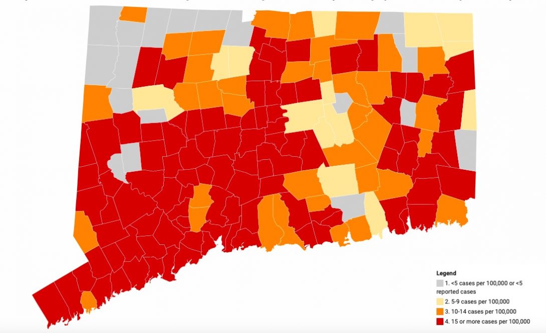
Maps from the 2020 Presidential election can tell different stories depending on how the information is shown – whether it be a simple “red” or “blue” map on which candidate won the Electoral College vote in each state, a county-by-county winner map, or a map that uses “purple” to show percentages of popular vote and not winner-take-all.
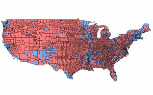
“Our students who are training to become teachers debate on what maps should be used if they want to tell the truth about the election,” says Marcus. “It’s a very clear example of how maps can be subjective based on the decisions that a mapmaker makes or the purposes they have.
“One of the ideas we are trying to get at in this article is that maps are subjective documents. They should be treated just like we treat any other document in a social studies classroom or how any adult in society should approach the information they are getting in the news.”
Understanding maps is part of a bigger concerns that citizens need to be properly informed as future leaders are selected.
“I think that the bigger context is that we live in a time where there’s a lot of information,” says Levine. “There’s great concern a democracy can’t survive or thrive if we don’t have a shared set of facts. If we don’t prepare people to use maps, including interactive maps, we increase the odds that we citizens will be manipulated by misinformation or very selective versions of the truth.”
The COVID-19 pandemic has also seen a need for map literacy and has been a boom for online and interactive maps.
“COVID was a motivation for us to do this paper,” says Marcus. “COVID has not changed the way we use maps, but it has emphasized the importance of maps in thinking about public health, in determining public policy and a source of information that is important to society.”
Maps have shown prime locations of COVID-positive tests, hospitalizations, and vaccination rates.
“The pandemic has highlighted how important maps can be and how much policy makers can use data from maps in driving their decisions about items like mask mandates and vaccines,” says Marcus. “COVID has really emphasized how critical they are.”
The ease of creating on online map has made it even more critical for people to have a strong map literacy.
“Content online can be created by almost anybody now and it can be accessed by almost anyone,” says Marcus. “You don’t have to buy the newspaper, you don’t have to buy the book and there is very little accountability and oversight in the production of some online maps. Online maps can be multi-layered and have hyperlinks, which you can’t do with a static map. They can be updated and changed very frequently. That has made maps a different beast for public consumption.”