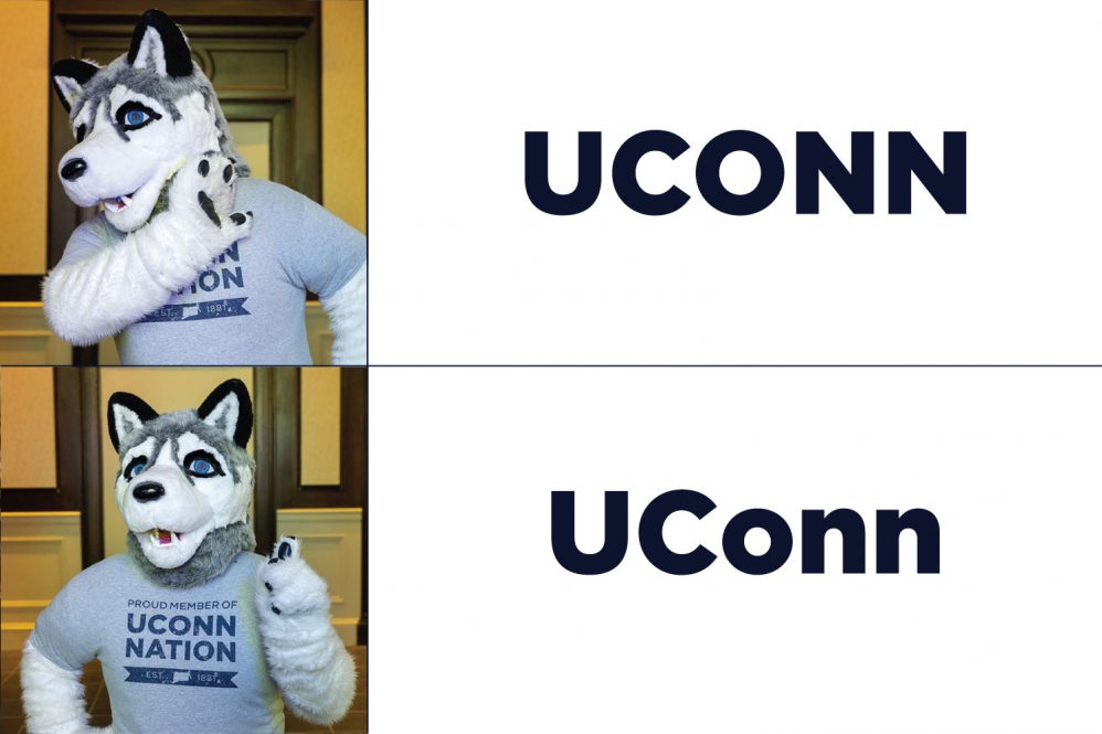
It’s UConn. Not UCONN, U-Conn, or even Yukon. Call us UConn.
Any frequent visitor to “UConn Twitter” knows that some of these alternative spellings (especially The Washington Post’s inexplicable hyphen use) rankle the feathers of the most die-hard UConn fans.
“As a former English major and current pedant, it drives me crazy to see it written ‘UCONN,’” says Meghan Bard ’03 (CLAS), a contributor to the UConn sports blog “A Dime Back.” “It is not an acronym, it’s an abbreviation of the University of Connecticut, so only the U and C should be capitalized. It looks weird written in all caps, and just shows a lack of care when a publication gets it wrong.”
While it may seem silly to outsiders, writing the University’s nickname properly — with a capital “U,” a capital “C”, and a lowercase “o-n-n” — matters.
“Spelling UConn the correct way is an integral part of our identity as a public university,” says Tom Breen, UConn’s director of news and editorial communications.
Maintaining the integrity of the UConn brand is crucial to reflecting our excellence in our community and beyond, say the professionals in the Office of University Communications tasked with upholding the brand.
“Our brand guidelines reflect our proud history and strength as a top public research university,” says Christine Ballestrini, assistant director of branding and visual identity. “The UConn brand reflects the core values of the institution and must be presented in one uniform voice.”
Where did the name “UConn” even come from?
To answer that, you need to start at the very beginning. UConn was founded in 1881 as the Storrs Agricultural School, a moniker it would hold until 1899 when it became Connecticut Agricultural College. After a period of growth in the early 20th century, the school was renamed Connecticut State College in 1933 when it began awarding Bachelor of Arts degrees. On May 26, 1939, the Connecticut General Assembly approved a bill changing the name of the institution to the University of Connecticut. According to Breen, it was around this time that the word “UConn” began to be used within the campus community.
“When the Husky mascot was introduced in the 1930s it was a play on the Canadian Yukon territory near Alaska, due to how cold winters were in Storrs,” Breen says. “‘UConn’ as an abbreviation seemed like a natural fit, as the postal code for Connecticut at the time was Conn.”
But wait — why is our wordmark in all capital letters?
A major point of confusion on the proper way to write UConn stems from the official University and UConn athletics wordmarks, both of which feature all capital letters. In 2013 the University officially adopted “UConn” as the primary visual identifier of the institution, as part of a major rebranding effort that occurred in partnership with Nike. At the time, then-President Susan Herbst said, “As an institution, for years we have made use of UConn as institutional nickname of sorts. But while we see it as shorthand, it appears that throughout the nation — due to our athletic success no doubt — most everyone refers to the university as UConn.”
The official University logo adopted then is the word “UCONN” in a specially created font called UConn Extended. Eric Rickabaugh is the owner and creative director of Rickabaugh Graphics and is responsible for designing the UConn Extended font. He recalls the thought process that went into the font design while he sketched it out on a flight home from visiting the Storrs campus.
“I was excited with how quickly it came together and how unique yet simple it was,” says Rickabaugh. “The UConn Huskies uniforms had been featuring a condensed sans serif ‘UCONN’ for a while. We wanted to maintain that look but with a custom and proprietary design. The new UConn font had a similar feel but with a nice twist of the arched tops and bottoms. It was obviously well-liked because many other schools and teams started to copy it.
“Flattering, but not the kind of flattery that we prefer,” he says.
The wordmark is seen on everything from recruitment materials and business cards to mugs, T-shirts, and the now-iconic gateway sign at the entrance to campus on Route 195. Like any brand, the University has a policy and guidelines surrounding the use of the wordmark to maintain the integrity of the brand.
“From a brand perspective it’s very important to have a visual identifier for the University,” says Tracy Anderson, senior director for creative strategy and brand management. “We maintain specific rules and guidelines for these visual representations of the University so we can ensure cohesive and consistent communications that strengthen our brand and avoid inconsistencies that could potentially skew our messaging or mission.”
But then why are UConn folks so bent out of shape when they see “UConn” written using capital letters in other places?
“A wordmark is a type of logo, but the way something is represented in its branding doesn’t always translate to how it would be written in editorial, marketing, or casual uses,” says Anderson.
Many household brand names have similar differences between their name and their logo or wordmark. For example, the logo for the credit card company American Express features the name of the company in all caps, but anytime the corporation is referenced in text, it’s written as “American Express.” Other companies such as Whole Foods, Tesla, National Geographic, and Boeing all follow the same principle.
“Ultimately, it’s not a huge deal,” Breen says, before catching himself. “No, wait, scratch that. It is a huge deal. It is the hugest deal. Please stop writing ‘UConn’ in all caps. You’ll feel better, we’ll feel better, the world will be a better place.”


