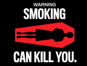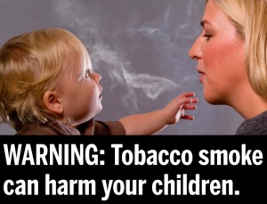
The days of the small Surgeon General’s warning on the side of cigarette packs are ending. The U.S. Food and Drug Administration has announced that it is mandating bolder health warnings on cigarette advertising and packages in an attempt to get people to quit and to remind would-be smokers of tobacco’s dangers.
It is the biggest change in tobacco warnings in 25 years. Some of the 36 graphic images suggested by the FDA are daunting: a mottled brown diseased lung; an emaciated, hollow-eyed cancer patient; a close-up of a diseased mouth with an open sore and rotting teeth.
Nine graphic warnings are scheduled to be selected by June 2011 and manufacturers will be required to include one of the warnings on cigarettes for sale in the United States, beginning Oct. 22, 2012.
But will the plan work?
Ross Buck, a professor of communication sciences in the College of Liberal Arts and Sciences, has done extensive research into human motivation, emotion, and risk communication. He says the vivid warnings should have more of an impact than the Surgeon General’s cautionary text because they evoke emotion and therefore resonate at a deeper level with individuals who encounter them. Buck suggests the harsher warnings are necessary to counter the aggressive marketing campaigns of big tobacco companies.
“Advertising campaigns for tobacco products have long promoted unhealthy smoking behavior by linking their brands to positive images and emotions in messages that have been directed particularly toward young people,” says Buck. “Such advertisements have been utilized with great success for decades, effectively creating sustained increases in tobacco use and diverting attention from potentially harmful effects, resulting in the mindless acceptance of risk on the part of consumers. These enormously effective emotional appeals belie the small ‘warning labels’ currently imposed on tobacco and alcohol packaging in the United States. Those warnings are not effective because they are not noticeable and they do not evoke emotion.”

Canada has been displaying graphic warnings on cigarettes since 2001. Since then, 39 other countries have adopted similar requirements for pictorial warnings on cigarettes including Australia, New Zealand, Brazil, Chile, Thailand, Egypt, Iran, Panama, and Uruguay, which has the world’s most stringent warnings covering 80 percent of all cigarette packaging.
Buck has been studying warning labels around the globe for some time as part of his research into the role emotion plays in dictating human motivation and behavior. Buck recently co-authored a chapter titled “Emotion, Warnings and the Ethics of Risk Communication” for the soon-to-be-published Handbook of Risk Theory (Springer, 2011). He shared authorship of the article with Rebecca Ferrer, a 2009 UConn Ph.D. and research fellow with the Behavioral Research Program at the National Cancer Institute.
“Emerging research on decision-making has found that emotion plays a critical role in reaching optimal conclusions,” Buck says. “Although often overlooked in academic research on persuasion, emotions are employed with great effectiveness in advertising and marketing. Advertisements and commercials are not intended only to demonstrate the useful features of a product; rather, they are designed to associate the product with positive emotions through branding.”
In order to sell their products, many companies load their advertising with uplifting music while vigorous, strong, beautiful, and healthy people frolic around loving and enjoying life. These ads associate the product with positive emotions of pleasure, pride, satisfaction, and accomplishment, according to Buck. Even when warning information must be provided – as in television advertisements detailing the possible side effects of drugs – it is typically presented in pleasant, reassuring contexts so that it is likely that the viewer will overlook and dismiss the dangers, he says.

To be effective, warnings sometimes need to be a bit shocking and unpleasant, Buck says.“A warning must command attention, stimulate memory, evoke emotion, convey consequences, and communicate safe behavior. An effective warning must therefore be conspicuous, memorable, and, in some cases, unpleasant.”
Federal officials hope the attention-getting warning labels will place renewed emphasis on smoking as a serious health threat as the country’s anti-smoking efforts have waned in recent years. About one-fifth of the nation’s adults, or 46.6 million people, and nearly a fifth of the country’s 3.4 million teenagers, are smokers, according to the Centers for Disease Control and Prevention. Public health officials estimate that roughly 1,000 teenagers and children become regular smokers every day and another 4,000 try smoking for the first time. About 400,000 people die every year from smoking-related health problems and treating illnesses related to smoking costs the nation’s health care system more than $96 billion a year.
Buck says the full-color, graphic warning labels are a low-cost intervention that has had proven success. And while graphic warning labels may stimulate people’s emotions and encourage them not to smoke, like the current warning labels on cigarettes, they must be changed occasionally so that individuals don’t get numb to the message.
“It is well known that even highly unpleasant images can lose their impact with repetition,” says Buck. “It is important that they be regularly refreshed to maintain their effectiveness.”


