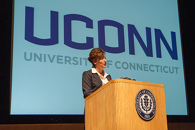
During her second annual State of the University address, held this afternoon on the Storrs campus, UConn President Susan Herbst announced the University’s newly adopted visual identity program and introduced a new custom wordmark for the institution.
UConn’s new visual identity program will serve to unify and promote the University’s distinct institutional brand at a time when consistently presenting an image of excellence across the University has become vital, Herbst said.
“We need to broadcast who we are or we will waste away, as other very sophisticated and successful universities dominate public discourse and the search for knowledge,” Herbst said during her address.
The new primary wordmark – presented as “UCONN,” in all capital letters – lies at the center of the University’s visual identity and has been designed to create a powerful symbol that is representative of the University as a whole. Recent University research indicates that the University of Connecticut is widely known today as UConn; a number of other institutions have similarly embraced shortened school names as their primary naming convention for their academic and athletics programs, including MIT, UCLA, Georgia Tech, Pitt, and Penn.
“As an institution, for years we have made use of ‘UConn’ as an institutional nickname of sorts,” Herbst said. “Recognizing that there is great value and recognition in this unique identifier, going forward, we are adopting ‘UConn’ as one primary visual wordmark for the entire institution.”
The newly adopted wordmark has been created for institutional and academic use across the University. It is a modified version of the wordmark developed in recent years for the UConn Athletics program, which began working with Nike last year to unify the numerous disparate logos used by various UConn athletics teams.
[yframe url=’http://www.youtube.com/watch?v=Szh88NbNYqA’]
‘We’re Not Breakfast Cereal’
In recent decades, the ways in which universities communicate with their key audiences – whether prospective or current students, parents, faculty, staff, the external media, or the public – has evolved radically and permanently. The rise of the Internet, social media, and smartphones has made around-the-clock communications inevitable, and represents a major shift in how colleges and universities have traditionally operated.


With more communications channels in use today than ever before, higher education institutions are striving to be more responsive and interactive with their respective communities – and to stand out from their peers.
In light of the changing higher education landscape, the University of Connecticut has sought to refine and strengthen its own brand.
“We’re not breakfast cereal, and we’re not a detergent. But we still need to communicate what we do, why we do it, how we do it, and that we do it well. So branding actually matters a great deal,” Herbst said. “As an institution with a global reach, we must compete on an international level for virtually everything: for students, faculty, staff, grants, awards, donations – you name it. And when we compete, we need to present ourselves at our very best, because how key audiences perceive our academic strength and overall reputation influences the choices they make.”
Jonathan the Husky
UConn’s Jonathan the Husky will continue to serve as a secondary graphic element for the institution, Herbst said, referring to a new look for the husky, which will be unveiled on April 18. The Jonathan Husky image has changed several times since the husky dog was first adopted as the University mascot in 1935, when the original Jonathan was a brown, black, and white pup. There have since been five different Husky dog logos used, with the most recent update in 2002.

The oak leaf will also remain as a secondary graphic element. Similarly, the UConn seal, which contains the oak leaf, will remain unchanged. The colors of the institution will continue to be navy and white, with red, gray, and metallic serving as accent colors for athletic teams.
An updated stationery template system, graphics standards manual, web standards, and color standards will be made available online to the campus community and vendors in June 2013, with university-wide conversion to the newly adopted visual identity to be completed by June 2014. The visual identity standards will be used across all forms of print and digital media, including websites, print publications, and facilities across campus.
For more information, visit logo.uconn.edu.
Further University rebranding efforts will be introduced later this year.